Just recently I decided to gauge the extent of my improvement in Photoshop and post processing in general with a simple challenge. I took one of my favourite photos from the past and re-processed it using my current abilities, from the raw files to completion, and see what the result would be. Luckily I haven’t looked at the finished product of the photo I shot and edited nearly two years ago for quite some time, so I had no pre-conceived notions of how I wanted it to look. The differences in the edit were quite profound as my early efforts in HDR photography always began with multi-exposure blending using HDR software like Nik HDR Efex or Photomatix, while my current workflow consists almost exclusively of manual blending. With manual blending I was able to control exactly what parts of my three exposures got blended and give me a much more refined and cleaner base to perform my edits from. The three exposures in question can be seen below:

My original edit – which I believed to be a spectacular shot at the time and actually won quite a bit of fanfare – mostly involved blending the exposures in Photomatix, applying some sharpening, some contrast correction in Nik Color Efex, some saturation adjustment on the light trails and adjusting the geometry. The results of my initial efforts can be seen here:

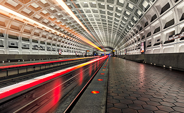
In the new image my workflow was much more targeted and subtle. I prepared each exposure carefully in Lightroom to make sure that the elements I wanted to preserve from each one were perfect at the raw level. I then moved them into Photoshop, stacked them on top of one another and spent about an hour blending the exposures using luminance masks and painted masks. My goal here was to create a uniform dynamic range and retain some of the detail on the left side of the frame. These details were lost in the original image since they were covered by the actual light trails shot which resulted in a bit of a haze created by the train itself obscuring for part of the tracks. By using luminance masks to isolate the light trails themselves I was able to extract just the light trail from the third exposure and create much better contrast between them and the darkness of the tracks. I then further evened out the exposure across the frame with several selective curves adjustments, and once that was done I focused on geometry and cleaning up the overall scene. In the past I spent quite a bit of time straightening out the level of the image and then distorting it to make the line in the bottom right as horizontal as possible as well. This time, rather than trying to make the line level and introducing a ton of distortion (and resulting in a cropped image), I simply removed the line altogether. I also got rid of one of the billboards on the left which took too much attention away from the light trails. For this I simply selected an area adjacent to the billboard, copied it, scaled it, placed it over top of the billboard and blended it in with a layer mask. Next I got rid of the terrible green/yellow color casts that you get when shooting the DC metro. I did this through a mix of the “selective color” filter and by isolating the green and yellow tones using two separate color range selections and adjusting the hue and saturation independently on both. Once this was cleaned up I moved on to adding contrast with Nik Color Efex’s “Pro Contrast” filter and performed sharpening with high pass filters and some subtle dodging and burning. I then took it back to Lightroom 5 and finished it off by adding a bit of Clarity and further desaturating greens using Lightroom’s HSL sliders. The final result looks something like this:
 While some may still prefer the original image due to its more colourful nature, I feel the new one is an improvement in many ways. It has much less noise, has a lot more detail and dynamic range, has a more pleasing overall tone, is sharper, has less distracting elements and most importantly, matches my current style of processing and aligns with what I feel is important in a final image.
The lesson here isn’t necessarily the steps that I took to edit the new image but rather the fact that we shouldn’t ever think we’re done learning. When I edited the original image I thought I knew everything about post processing and produced an absolutely killer image. Today as I review the two side by side I begin to wonder what the heck I was thinking back then. I’m also certain that if I perform this exercise two years from now I’ll think the same thing yet again. The problem that we face as we progress in editing is two fold: we don’t know how to do something, and we simply don’t know what to do. After two years I find my self better able to visualize the final product that I want to achieve and have a strong idea of what qualities I want out of my final image. The ‘how’ is merely a matter of learning and exercise, the ‘what’ is much less tangible. It’s a combination of reviewing the images of those that are better than you and finding those qualities to strive for while also working towards developing your own style. As technologies change and the way you view your images does too, the results invariably will as well. This is a process that never ends, and that is the beauty of photography.